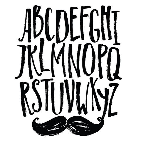
If you’re a reader, writer, or love design, you might already know a few of the 7 easiest fonts to read on screen and paper. There are some typefaces that look exceptionally better on different mediums than others and add much more clarity.
You probably know the feeling of looking at a newspaper or website and seeing text that is so ridiculously difficult to read that you don’t bother continuing. The graphic design whipping boy Comic Sans is usually the culprit.

Copyright: nenilkime / 123RF Stock Photo
There are two typefaces that exist: serif and sans serif. Serif fonts have extra strokes or designs on the letters, while sans serif fonts don’t have these details. It’s the difference between a font like Times New Roman and Arial, which are serif and sans serif respectively. Reading something on a screen is much different than on paper because of the pixels on a screen versus ink printed onto a page. It’s shown that serif fonts work better on print and sans serif fonts look fantastic on screen. You’ll see when you continue down our list how the serif fonts don’t look as appealing on your screen.
There isn’t a standard requirement for which fonts to use where, but that’s the rule that many graphic designers live by when working on projects. That’s why we also subscribe to that notion and compiled our list using it. Instead of one list of seven fonts, we chose to create two lists of seven that are great for reading on screen and seven that are great for reading on paper based on opinions from graphic designers. We then ranked according to visibility and readability, which is mostly based on how frequently these specific fonts were mentioned.
For a good read that shows you how well serif fonts look on paper, check out our list of 7 Easiest Dickens Novel To Read First. Keep on reading for facts about fonts:


