Google provides us with a lot of information and we can even find the easiest Google fonts to read on websites and mobile apps. There are plenty of choices but this list will narrow down your options.
Before computers and mobile gadgets were invented, we wrote our ideas in a journal or on paper. When typewriters came, we then could type our written ideas and send it for publishing. Thanks to modern technology, we now have computers to do all of this. Advertisements and announcements are written drafts that are also published in multiple copies and are either given to people or being posted on walls of buildings. As we know, advertisements are all about their look and message, and that look includes what kind of font is used. The agencies that manage printed advertising use the best fonts for print design, like Helvetica and Futura. If you want to be specific with the font that you want to use on your printed advertisement, you can look up the best Google fonts for print, which many claim are Lato and Ubuntu (which are both on our list, so they’re pretty popular). These can also be your best options if you are undecided of the font you will use. If you’re unlike me and very creative, you can even combine two fonts to make your document stand out. One of the best Google fonts combinations is PT Sans and PT Serif. If you don’t know many fonts off the top of your head, you can also search the font that would best suit your preference here on our list of the Easiest Fonts To Read On Screen and Paper.

Rawpixel.com/Shutterstock.com
The Google fonts have around more than 800 families, so searching for the best font you want to use would take up your whole day especially if you are not that familiar with how they look. Typewolf has narrowed it down to 40, which is their collection of best Google fonts in 2017. Among the best fonts are Open Sans, Lato, and PT Sans which are all on our list of easiest Google fonts to read on websites and mobile apps and each will be elaborated later on. In general, we must use the best fonts for mobile UI. You’re probably wondering “what is UI?” Or ‘what is a mobile UI?” UI is the abbreviation for user interface, which means an interaction between a user and a computer device. A mobile UI is clearly when a user uses touch sensitive gadgets like a tablet or a cellphone. This is why it is a must for developers to use fonts that are friendly for gadget users because even the youngest of people are exposed early to this type of technology and you want your page to be aesthetically pleasing.
Thankfully, the Google fonts are free to use, but it is not necessary that you download all of the fonts. Once you have decided what font you want to use, input it on the search bar and click your chosen font to open it. Each font style has a plus sign on the upper right corner and when you drag your cursor over, it will show ‘Select this font.’ When you click it, a popup box will appear and on the upper right corner of it is a download sign. Once you download a font, you’re good to go as far as using it.
If you are running your own website or mobile app, it is necessary that you have readable fonts. Your readers and users will appreciate you for using the best Google fonts for headings or the best Google serif fonts even if they don’t know it. Good fonts will not give them headaches because they are trying to figure out the words they are reading. The Josefin Slab Google font is an example of a font that you can use best in the body text, to give you an idea of what we’re talking about. Although there are a lot of fonts to choose from, we’ve summarized them while coming up with the items on our list. To come up with this list, we relied on Answer The Public, Quora and Google Fonts to figure out what are the most commonly preferred Google fonts. These items are listed according to the number of styles each font has. What we have on our list as well, are the suggestions for perfect combinations especially if you are on the verge of developing your own website, writing a blog, or composing an e-book convenient for the readers.
Below is our list of 6 easiest Google fonts to read on websites and mobile apps.
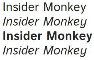
6. Istok Web
4 styles
The Google font Istok Web was developed in 2008 and has been a solid choice since. The goal of this font is to be shown on LCD screen displays and is most popularly used in the U.S. The perfect pairs of this font (which are also on our list) are Open Sans, Ubuntu, and PT Sans. Another font designed by the same designer is Heuristica.
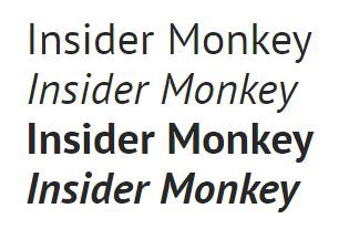
5. PT Sans
4 styles
Number 5 on the list of easiest Google fonts to read on websites and mobile apps is PT Sans that is widely used in Russia and in the U.S. The designers of this font are Alexandra Korolkova, Olga Umpeleva and Vladimir Yefimov, and their vision was released in 2009 by ParaType. ParaType is located in California and their service aims to develop and distribute multilingual font designs. Among their works are Latin fonts, Cyrillic, Greek, Arabic, Hebrew, Armenian, Georgian scripts. The compatible fonts with PT Sans are Open Sans, Lato, Roboto, Raleway, and its second family, PT Serif.
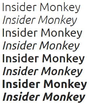
4. Ubuntu
8 styles
The inspiration for creating the Ubuntu typeface is the Ubuntu type of voice. Canonical is the company that funded the development of this font and the genius behind this creation is Dalton Maag. Maag develops typefaces to provide your need for a font for print, desktop, app and mobile use. Dalton also works with clients not only locally, but globally. The popular pairs for Ubuntu are Open Sans, Roboto, Lato, Oswald, and Raleway.
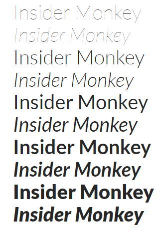
3. Lato
10 styles
Lukasz Dziedzic is the genius behind the typeface Lato which falls on the third spot of our list of 6 easiest Google fonts to read on websites and mobile apps. Lato is a Polish word which means ‘summer’, and as far as the font, it belongs to the sans serif family. The U.S. has the highest percentage of use for this font. It has the balance of both being serious and friendly, which is why people like it.
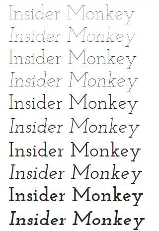
2. Josefin Slab
10 styles
Josefin Slab is most popular in the U.S., the United Kingdom, and Brazil. The designer Santiago Orozco originally started with Josefin Sans, which is the simple version of Josefin Slab. Santiago drew his interest for the typeface from typewriter attributes. He says since high school, he has always admired the Letter Gothic typeface and this is why Josefin Slab was born.
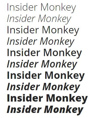
1. Open Sans
10 styles
Steve Matteson is the designer of the popular Open Sans typeface, which is most popularly used in the U.S. Open Sans is a great typeface for mobile, web, and even print as it is a simple typeface. It has an upright stress but friendly appearance. Roboto, Lato, Oswald, Raleway, and Montserrat are the popular pairings used for Open Sans.
That wraps it up for our list of 6 easiest Google fonts to read on websites and mobile apps.


