c. Size Classes

The conventional wisdom, when there is a market crisis, is that investors move their money to safety. While that has clearly happened with money shifting into US treasuries, the question is whether investors are abandoning smaller companies for larger ones, presumably driven by the perception that smaller companies are riskier than larger ones. To answer this question, I looked at all global companies, broken down by market capitalization into ten classes:
 |
| Download spreadsheet |
The results don’t line up with expectations, as small companies saw a small increase in overall market capitalization and large cap stocks registered the largest decline. It is worth noting that even among the smallest stocks, the median stock lost 7.73%, suggesting that the increase in value is coming from a small percentage of stocks in the group. (Looking at just US stocks, you get very similar results.)
d. Value and Momentum Classes
The drop in the market has provided some measure of vindication to those who have long been arguing that the market is over priced, but while the fact that the market was priced so richly set it up for a larger fall, breaking down the decline in market cap into classes can provide us some insight into whether the stocks that had gone up the most were the ones that saw the biggest drop off in value between February 14 and March 6. In the table, we break global stocks down into ten classes based upon the price change in the year prior to February 14 and look at the change in market capitalization, by class:
 |
| Download spreadsheet |
In keeping with the story that what goes up the most must come down the most, you find that stocks that had performed the worst in the year leading into February 14 had an increase in market capitalization, though the median stock was still down, within this group. Using another proxy for rich pricing, I also broke stocks down by PE ratio classes from lowest to highest, based upon market capitalization on February 14, 2020, and looked at the change in market value between February 14 and March 6:
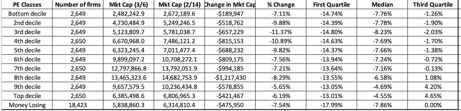 |
| Download spreadsheet |
Here, the evidence contradicts the market correction hypothesis, since there is no discernible relationship between PE ratios and market value change. In fact, the best performing stocks are in the top two deciles of PE ratios.
e. The Rest of the Story
One of the perils of getting focused on equity markets is that you can miss all of the action in other markets, and the changes in those markets can not only help augment the story that equities are telling us, but they can yield insight into other facets.
I. US Treasury rates
If the drop in stock prices over the last three weeks took your breath away, the shifts in the treasury market were even larger and more unsettling:

The 10-year US T.Bond dropped below 1% for the first time in history on March 3 and continued trending down to settle at 0.74% on March 6. In tandem, the other treasuries also dropped, bring the US dollar risk free rates closer to the Euro and Yen risk free rates. While some of the decline in rates can be attributed to a flight to safety, there is also a much depressing read of the same drop. To the extent that long term risk free rates are proxies for nominal economic growth, the treasury bond market seems to be signaling not just a shock to near-term economic growth from the Corona virus, but a long term decline. We will get a better sense of what the bond market is expecting, once equities settle in, but if the 10-year rate stays below 1%, it is not a good sign for the economy.