Which are the worst fonts to avoid on your resume?
Picture this scenario – you’re fresh out of school or just out a job and want to apply to get a new way to earn money, so you need a resume. The first thing you need to do is avoid these fonts on the list below.
There are countless fonts out there, many of them free, some of them available for purchase. There are so many good options to choose from that picking one that’s so bad is just poor judgment. Human resource specialists are none too happy when they find a resume written with these fonts for many reasons. They’re either hard to read, unprofessional-looking, or downright horrible.
There’s also the situation where specialists are just sick of a certain font that’s been overused by anyone and everyone. Fonts like Times New Roman and Arial have been so overused that everyone is sick of them, they’ve lost a lot of their personality. On the other hand, they’re pretty much safe to use unless you’re looking for a more creative job, in which case your imagination has to shine through. Times New Roman and Arial have been included on our list of the 7 best fonts to use on your resume, but you should keep in mind that they are often quite controversial among HR specialists
In order to create our list, we took a look at various other sites, including Bloomberg, Monster and DesignSchool, to name a few. Depending on how often the fonts were mentioned, we created out ranking of the 7 worst fonts to avoid on your resume.
7. Chalkduster (and all similar)
Why would anyone use such a font for their resume is beyond us, but it apparently happens. This is a nice font if you’re trying to create a pretty banner and make it look like someone wrote on the wall or something similar, but you really shouldn’t go for it if you’re trying to represent yourself professionally.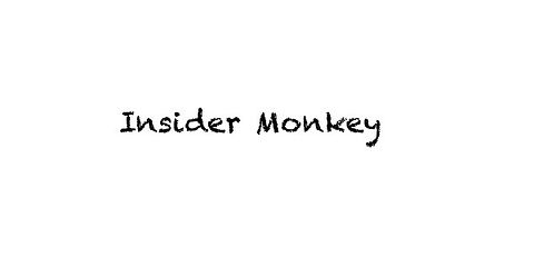
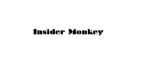
6. Braggadocio (and all similar)
This is a pretty old typeface, stencil-like in appearance, which makes it rather inappropriate for a resume unless you’re applying for a street art crew that really likes stencils. There are many fonts that are similar in shape and form, so the rule applies to them all, regardless of which one you have on your list. After all, it doesn’t look all that professional, and it’s not easy to read by any means, so just avoid it.
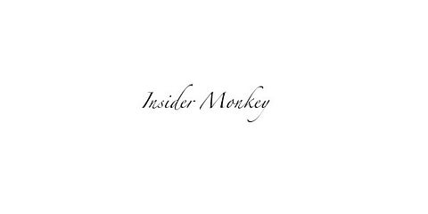
5. Zapfino (and all similar)
There’s nothing wrong with Zapfino if you’re planning to use it for the banner for your blog, or for printing out a party invitation, but this connected script isn’t the best choice for a resume.
That’s mainly because it can be difficult to read, especially since time is of the essence and human resources specialists don’t like wasting time trying to figure out if that’s an “e” or an “o” in there. Either way, connected scripts, no matter how pretty they look (and they’re really so cute) just aren’t right for a professional occasion such as a resume.
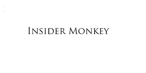
4. Trajan (and all similar)
Again, Trajan Pro looks rather nice, but there’s one big downside to it – there’s no lowercase option. Basically, you’d have to write your entire resume in capital letters, be them larger or smaller, which isn’t great. Even if there’s the small caps option, it’s still a capital letter, and you know what’s always being said when you type like that on the Internet, right? “Stop screaming at me!” That’s because using all caps comes off as aggressive and that’s not something you want to do when writing a resume.
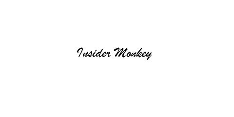
3. Brush Script (and all similar)
This particular font looks like handwriting, which is nice, but not for a resume. Not only is this a bad idea because these types of fonts are sometimes difficult to read, but Brush Script, in particular, has been so overused that it is starting to give out a completely different vibe to the one it was intended to – aka nostalgic. Of course, this might still be an option depending on the industry you’re looking to work in, but as a general rule, Brush Script is not a good resume choice.
2. Courier
Let’s be clear about something – if you don’t own and use a typewriter, stop pretending that you do. Courier is a cute font that could work well when you’re typing out a story you want to keep to yourself, or maybe use it when you’re playing around Photoshopping, but stay away from it when it comes to resumes. The letters are equally spaced, which will make your entire resume look odd and difficult to read, and you’ll certainly go over the golden number of pages advisable for resumes, which is two.

1. Comic Sans
Do we really need to say why this is a bad idea? Comic Sans is the most detested font in history, and it’s a clear sign of a lack of professionalism. Therefore, if you’re over the age of high school and looking for a typeface for an actual resume, don’t pick Comic Sans.
The font has had a period of glory after it was created back in the 90s to replicate the comic book speech bubbles, but it looks entirely too childish to be appropriate for a resume that you actually hope to get you a job. Comic Sans is by far at the top of the list of the 7 worst fonts to avoid on your resume.
