In the weeks since my first update on the crisis on February 26, 2020, the markets have been on a roller coaster ride, as equity markets around the world collectively lost $30 trillion in market cap between February 14, 2020 and March 20, 2020, and then clawed back more than half of the loss in the following month. Having lived through market crises in the past, I know that this one is not quite done, but I believe we now have lived through enough of it to be able to start separating winners from losers, and use this winnowing process to address three big questions that have dominated investing for the last decade:
– Has this crisis allowed active investors to shine, and use that performance to stop or even reverse the loss of market share to passive vehicles (ETFs and index funds) that has occurred over the last decade?
– Will this market correction lead to growth/momentum investing losing its mojo and allow value investors to reclaim what they believe is their rightful place on top of the investing food chain?
– Will the small cap premium, missing for so many decades, be rediscovered after this market shock?
I know each of these is a hot button issue, and I welcome disagreement, but I will try to set my biases aside and let the data speak for itself.
As with my prior updates, I will begin by surveying the market action, first over the two weeks (4/17-5/1), following my last update, and then looking at the returns since February 14, the date that I started my crisis clock. First up, I look at returns on stock indices around the world, breaking them up into two periods, from February 14 to March 20, roughly the low point for markets during this crisis and from March 20 to May 1, as they mounted a comeback.
The divide in the two periods is clear. Consider the S&P 500, down 28.28% between 2/14 and 3/20, but up 22.82% from March 20 and May 1, resulting in an overall return of -11.92% over the period. While the magnitudes vary across the indices, the pattern repeats, with the Shanghai 50 close to breaking even over the entire period, and the Bovespa (Brazil) and the ASX 200 (Australia) delivering the worst cumulative returns between 2/14 and 5/1. As stock markets have swooned and partially recovered, the yields on US treasuries dropped sharply early in the crisis and have stayed low since.
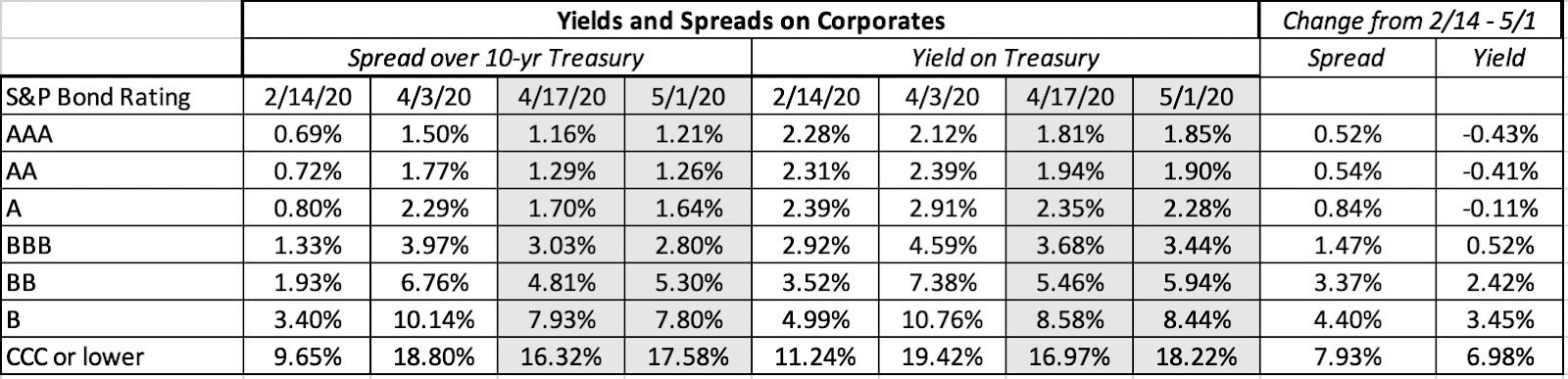
The 3-month treasury bill rate, which was 1.58% on February 14, has dropped close to zero on May 1, and the treasury bond rate has declined from 1.59% to 0.64% over the same period. The much talked about inverted yield curve late last year, that led to so many prognostications of gloom and doom, has become upward sloping, and staying consistent with my argument that too much was being made of the former as a predictor of recession, I will not read too much into its slope now. Moving to the corporate bond market, I focused on 10-year corporates in different ratings classes:
When Jeff Bezos said that one breakthrough technology would shape Amazon’s destiny, even Wall Street’s biggest analysts were caught off guard.
Fast forward a year and Amazon’s new CEO Andy Jassy described generative AI as a “once-in-a-lifetime” technology that is already being used across Amazon to reinvent customer experiences.
At the 8th Future Investment Initiative conference, Elon Musk predicted that by 2040 there would be at least 10 billion humanoid robots, with each priced between $20,000 and $25,000.
Do the math. According to Musk, this technology could be worth $250 trillion by 2040.
Put another way, that’s roughly equal to:
175 Teslas
107 Amazons
140 Metas
84 Googles
65 Microsofts
And 55 Nvidias
And here’s the wild part — this $250 trillion wave isn’t tied to one company, but to an entire ecosystem of AI innovators set to reshape the global economy.
It’s a leap so massive, it could reshape how businesses, governments, and consumers operate worldwide.
Even if that $250 trillion figure sounds ambitious, major firms like PwC and McKinsey still see AI unlocking multi-trillion-dollar potential.
How could anything be worth that much?
The answer lies in a breakthrough so powerful it’s redefining how humanity works, learns, and creates.
And this breakthrough has already set off a frenzy among hedge funds and Wall Street’s top investors.
What most investors don’t realize is that one under-owned company holds the key to this $250 trillion revolution.
In fact, Verge argues this company’s supercheap AI technology should concern rivals.
Before I reveal the details, let’s talk about how some of the richest people on the planet are positioning themselves.
Bill Gates sees artificial intelligence as the “biggest technological advance in my lifetime,” more transformative than the internet or personal computer, capable of improving healthcare, education, and addressing climate change.
Larry Ellison — through Oracle, is spending billions on Nvidia chips and partnering with Cohere to embed generative AI across Oracle’s cloud and apps.
Warren Buffett — not known for tech hype — says this breakthrough could have a ‘hugely beneficial social impact.
When billionaires from Silicon Valley to Wall Street line up behind the same idea — you know it’s worth paying attention to.
Even as we admire what Tesla, Nvidia, Alphabet, and Microsoft have built, we believe an even greater opportunity lies elsewhere…
But the real story isn’t Nvidia — it’s a much smaller company quietly improving the critical technology that makes this entire revolution possible.
And judging by what I’m hearing from both Silicon Valley insiders and Wall Street veterans…
This prediction might not be bold at all:
A few years from now, you’ll wish you’d owned this stock.
The best part? You can discover everything about this company and its groundbreaking technology right now.
I’ve compiled everything you need to know about this groundbreaking company in a detailed, members-only report.
Trust me — you’ll want to read this report before putting another dollar into any tech stock.
For a ridiculously low price of just $9.99 a month, you can unlock a year’s worth of in-depth investment research and exclusive insights – that’s less than a single fast food meal!
Here’s why this is a deal you can’t afford to pass up:
• Access to our Detailed Report on this Game-Changing AI Stock: Our in-depth report dives deep into our #1 AI stock’s groundbreaking technology and massive growth potential.
• 11 New Issues of Our Premium Readership Newsletter: You will also receive 11 new issues and at least one new stock pick per month from our monthly newsletter’s portfolio over the next 12 months. These stocks are handpicked by our research director, Dr. Inan Dogan.
• One free upcoming issue of our 70+ page Quarterly Newsletter: A value of $149
• Bonus Reports: Premium access to members-only fund manager video interviews
• Ad-Free Browsing: Enjoy a year of investment research free from distracting banner and pop-up ads, allowing you to focus on uncovering the next big opportunity.
• 30-Day Money-Back Guarantee: If you’re not absolutely satisfied with our service, we’ll provide a full refund within 30 days, no questions asked.
If you’re thinking about getting in, don’t wait – because once Wall Street catches wind of this story, the easy money will be gone.
Space is Limited! Only 1000 spots are available for this exclusive offer. Don’t let this chance slip away – subscribe to our Premium Readership Newsletter today and unlock the potential for a life-changing investment.
Here’s what to do next:
1. Head over to our website and subscribe to our Premium Readership Newsletter for just $9.99 a month.
2. Enjoy a year of ad-free browsing, exclusive access to our in-depth report on the revolutionary AI company, and the upcoming issues of our Premium Readership Newsletter over the next 12 months.
3. Sit back, relax, and know that you’re backed by our ironclad 30-day money-back guarantee.
Don’t miss out on this incredible opportunity! Subscribe now and take control of your AI investment future!